Search for Indicators
Disparities Dashboard
View all indicators that include breakout data by topics such as race/ethnicity, age and gender. These breakout topics allow indicators to be compared across groups and can be helpful in identifying areas where gaps exist between these groups.
The dropdown menu below can be used to look through all available indicators and choose one of interest. This menu also has a search bar if you are interested in looking for a particular topic. Once an indicator is selected, the page will update to show data for that indicator at all available geographic levels. Clicking on one of the indicators below will take you to a Details page for that indicator where you can learn more about how the indicator is defined, see the source of the data, and view changes in the indicator over time.
Each indicator will have a section underneath it showing the value of the indicator among different population groups. Placing your mouse over the various icons within these indicators will provide additional information about how to interpret these numbers and images. More Information about interpretation is available in the Legend, accessible by clicking the "See the Legend" button on the left side of the page.
Indicator Gauge Icon Legend
Legend Colors
Red is bad, green is good, blue is not statistically different/neutral.
Compared to Distribution
 the value is in the best half of communities.
 the value is in the 2nd worst quarter of communities.
 the value is in the worst quarter of communities.
Compared to Target
 meets target;
  does not meet target.
Compared to a Single Value
 lower than the comparison value;
 higher than the comparison value;
 not statistically different from comparison value.
Trend

 non-significant change over time;
 significant change over time;
  no change over time.
Compared to Prior Value
 higher than the previous measurement period;
 lower than the previous measurement period;
 no statistically different change from previous measurement period.
 Significantly better than the overall value
 Significantly worse than the overall value
 Significantly different than the overall value
 No significant difference with the overall value
 No data on significance available
4th Grade Students Proficient in English/Language Arts
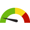
Value
Compared to:
4th Grade Students Proficient in English/Language Arts State: Ohio
4th Grade Students Proficient in English/Language Arts State: Ohio
58.9%
(2022-2023)
Compared to:


Prior Value
(62.5%)
Prior Value compares a measured value with the previously measured value. Confidence intervals were not taken into account in determining the direction of the comparison.
Trend
This comparison measures the indicator’s values over multiple time periods.<br>The Mann-Kendall Test for Statistical Significance is used to evaluate the trend<br>over 4 to 10 periods of measure, subject to data availability and comparability.
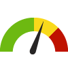
4th Grade Students Proficient in English/Language Arts County: Franklin
4th Grade Students Proficient in English/Language Arts County: Franklin
54.7%
(2022-2023)
Compared to:

OH Counties
The distribution is based on data from 88 Ohio counties.
OH Value
(58.9%)
The regional value is compared to the Ohio State value.
Prior Value
(58.9%)
Prior Value compares a measured value with the previously measured value. Confidence intervals were not taken into account in determining the direction of the comparison.
Trend
This comparison measures the indicator’s values over multiple time periods.<br>The Mann-Kendall Test for Statistical Significance is used to evaluate the trend<br>over 4 to 10 periods of measure, subject to data availability and comparability.
